#Its the fist one I make with lineart and colours!
Explore tagged Tumblr posts
Text

A sad little robot, inspired by this song!
#robot#employees robot#business robot#sad robot#animation#soft colour#violet palette#nature#louie zong#hello world#I like how it turned out#Its the fist one I make with lineart and colours!#my animations#my art#Spotify
22 notes
·
View notes
Note
Have you reviewed the Bruce, and particularly my favorite variety of the Bruce (the ULTRA ultra UC version)?
(I don't have any Pokemon review requests in my inbox right now but I do have a few Neopet requests, so I'll go ahead and do one of those.)


I might as well talk about the history of the Bruce first, because while I don't normally bother going over past iterations for these reviews everyone should know that the first incarnation of the Bruce was a 150 x 150 photograph of esteemed British entertainer Bruce Forsyth sloppily recolored and slapped onto a circle. I literally could not make this up if I tried.

While the Bruce isn't the only Neopet that started off as a human, it A) was the only one to start with a realistic photograph instead of a caricature, and B) is also the only one to retain some aspects of its human design: namely the signature bow(tie) and the name (plus penguins already look like they're wearing suits in a way).
Visually, today's modern Bruce is pretty cute. It's mostly just a standard penguin, but they've got very appealing faces and a sort of plush chubbiness to them that not a lot of Neopets sport. While pets wearing clothes by default isn't always my favorite thing, the bow does work well with everything else and still makes sense in-universe for anthro Bruces (side note: the irony of an anthro Bruce is not lost on me).

The body is broken up with distinct markings that are based off of emperor penguins—though ironically, they're based on emperor chicks, to the point where the Baby Bruce is just a slightly smaller version of the regular Bruce. The Bruce does extend the face markings down into an underbelly however, which looks very natural and helps to break up the torso.

Visually, nothing really changed about the Bruce with customization other than it standing up and gaining a fist. I think I like the converted version a bit more, as while the original pose was cute it was also harder to see aspects of the design (like the tail). The flipper anatomy and general lineart/details have also been greatly approved. Also, the bow became removable, which is a bonus.
Favorite Colours:


Island: A surprisingly nice take on the colour, the island Bruce has an usually dark brown palette, which pops nicely with the white markings and compliments the flowers and greenery nicely. The markings are well-placed with good thought as to how they interact with the body shape and the green eyes are pretty and draw the color through the design well. The floral accents can also be removed, which provides a pretty nice base colour as well.

Wraith: The wraith Bruce is quite a bit different than most takes on the colour. Wraith pets are usually flat with intricate body shapes—think like a tattoo. However, the wraith Bruce opts for a more solid body shape that uses subtle gradients and very carefully placed highlights to give it a sense of depth. The face and beak look really good here, and the way the white highlights on the edge of the body fade off into nothing is really cool. My only minor quibble is that I wish there was one thin line indicating the underbelly markings, as the torso looks a bit too solid here.

Toy: The toy Bruce is slightly redundant because the plushie Bruce is already a thing, but between the two, I do like the toy design a bit more. The flocked and fluffy look is super cute and works great for the pet, and I like the contrast between the hard flippers and beak and the rest of the body. The penguin-like monotone body color is offset by the red bow, which has a nice subtle plaid pattern to it. My only nitpick is that I would've just dropped the single head feather entirely, as it looks out of place and doesn't really make logical sense. Still, good stuff all around.
47 notes
·
View notes
Text
Hi moots and whoever else sees this post
I’m flying out to see my buddy and I’m currently on layover. I just wanted to share what happened on my last plane because I am SO squishy and happy over it
So I draw when I’m on planes. I can’t ever sleep on them and there’s no internet (I’m not paying) so I just listen to downloaded playlists I have and I draw. Today was no different, I was drawing my persona in a new outfit.
I went up to go to the bathroom and when I came back, the people in the seats behind me were like “YOU! YOURE AMAZING” and the guy in the aisle seat offered me a fist bump. At first I did not get it but I picked up that they’ve been watching me draw for the entire flight and they’re absolutely floored by my art /pos
It made me SUPER happy. I showed them the lineart I finished and they were all commenting on how gorgeous the character is (made me feel nice because she looks a lot like me). So when I went to colour the piece I made sure my phone was angled so the people behind me could continue to watch. I don’t mind being watched while I draw and it made me happy that they were enjoying it.
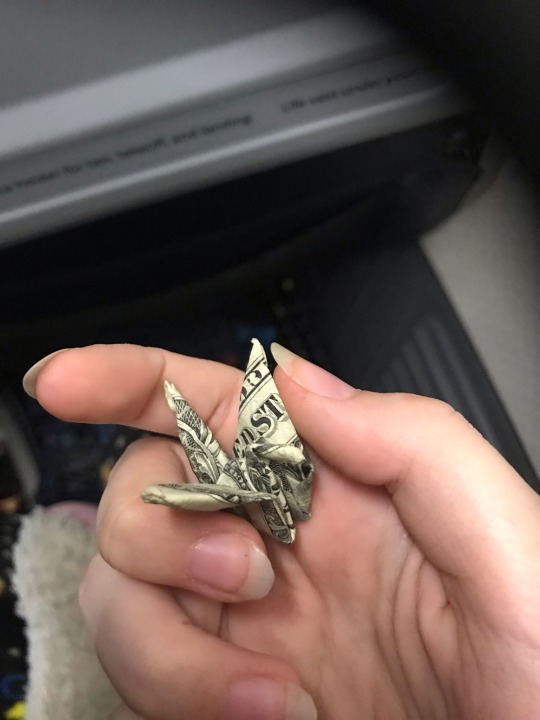
I make it through most of my colouring before I feel a tap on my shoulder. Turn around and the guy in the aisle seat holds out a tiny origami crane made out of a dollar bill, he says it’s a thank you for letting them all watch me draw.
Im already giddy and happy as is but. This is literally the first time ive ever gotten MONEY from my art? I didn’t even give it away or anything, and it was only a dollar, but just the single dollar crane meant so much more to me than I think the guy who gifted it knows.
Anyway I finished colouring and I offered my phone to the three behind me and the girl in the middle seat borrowed it to go show the people sitting across from them what I was drawing, explaining I’ve been doing this the whole flight and they’ve been watching. She gave it back once like everyone in that row had witnessed my drawing and it absolutely made my day
As I got off the plane, one of the guys in the seats across from those people walked alongside me and he told me that my art is beautiful and that my style could make really beautiful tattoos. I stopped at the gate after he walked away to check where I was going next and the guy from the aisle seat walked up behind me and gave me a fist bump as the two girls waved before wandering off. He told me that with my artistic ability I should look into getting an ipad for drawing. Told me again that my art’s great before he walked off
I have NOT been able to wipe the smile off my face since all that happened, Its been like 20 minutes
Anyway here’s the crane I dunno if I even have it in me to spend it, I tucked it into my backpack. Maybe I’ll just display it as a tribute to this great memory
#eely rambles#the art I’m making is kind of lowkey spoilers for my friends who all follow me but when I finish it I might share it here#I’ll just. not give context and hope they don’t figure it out /j/j
1 note
·
View note
Note
sorry it took me ages to get around to this (shakes fist at life in general) but here i am with some trademarks of your art!! obviously i think of your extremely feral scrunkly lady noire as a trademark but you already know how much i love her heeheehee!!
i think what makes her feel so scrunkly though is the way you use lines - your lineart is both clean and sketchy at the same time, like every line feels deliberate and as though it's been put down very carefully to create a specific effect, but it's also full of energy and a life of its own! like the lines have just jumped from pen to page and it's so impressive that you can make your lineart feel carefully crafted, effortless, and wayward all at the same time!!
however having just rambled about lines you also do amazing lineless work!!! i really love your style when you use blocks of colours but because you choose the tones so carefully and place them so precisely it doesn't feel blocky! it feels smooth and natural and effortlessly minimalist despite requiring a lot of talent!! hmm...maybe your trademark is how effortless your art feels despite using complex techniques and obviously requiring a lot of careful thought? because that's definitely something i notice regardless of style!!
another big characteristic of your art for me is Fashion - not only are you able to put incredible looks together, but your art style really reminds me of the sketches fashion designers make!! (i think i mentioned this before and you said you wanted to be a fashion designer as a kid so it makes sense!!)
also in terms of specific features - a mask that looks like two parts that *just* meet in the middle is definitely one of your trademarks!! also girls with 50s pin up vibes!! oh and That Outfit with the stripey shirt and trousers/skirt with a patch (with big stitches...kind of like your lady noire!! was it inspiration??)
i feel like i could babble on about your art trademarks for a long time because you use lots of different styles and they're all unique to you and have their own individual trademarks!! your art is just very special imo!! *cradles it protectively in my hands*
omg hi cory!!!!! teehee im so happy that so many ppl assosiate lady noire with my art!! (also, do not apologize!!!! *joins you shaking your fist at life*)
AAAAAAA THANK!!!!! lineart is something ive definetely struggled with in the past, so im SO SO SO SO INCREDIBLE HAPPY that it comes over as sketchy but also clean!!! gah cory. you are gonna kill me with all these compliments!!!!! and i love how you describe it as having a life of its own- i usually like using my lineart as more of a ''guide'' as to where im gonna put the colours, then like. a template to fill in i guess??? NOT SURE HOW TO EXPLAIN IT LMAO BUT IM GLAD YOU LIKE IT
AND THANK YOU!!!!!! omg i feel like such an imposter rn lol, i always eyeball stuff HOWEVER it is definetely a Struggle to have stuff not look blocky if you for exampe have two similar in value/darkness colours next to each other so im rlly happy that my art feels smooth and nice!!!! thank you!!!! and !!! AAAA that means a lot!!! its definetely not something that id be able to put my finger on myself but you described it perfectly!! not sure about the careful thought part tho, my brain while drawing is half somewhere entirely else and half like. ah yes. Vibes. No no not like That. YES. hmm. lines. no., Hmmmmmm.. !! you give me too much credit lol <3 but im glad that ive succesfully created the illusion that i in fact do Think about what im drawing
EEEEEeEEEE ty!!! FASHION!!!! fashion has definetely had a huge influence on how and what i draw so it makes sense that thats reflected in my art!! and haha ty, im glad you like all the fits i put together!! :D
and teehee YES i LOVE drawing masks that way!!! and That Outfit!! now that you mention it, YEAH it IS kinda like lady noire!! it wasnt inspo tho! (at least not consciously)! also, its rlly interesting that you said that you get 50's pinup girl vibes from my art!! i dont rlly see it, but it does kinda make sense bc i always loved the vibrant colours and vibes from them!!
WAH THANK YOU!!!!!! cory im cradling YOU gently in my hands
Whats my art trademark?? (ask game!)
#i think its v funny how im putting that copied super normal sounding ask link right after 5 full paragraphs of me saying Stuff as if im don#e and back to normal again#(im not)#anywyas. tags.#ask#ask me anything!#ask game
8 notes
·
View notes
Text
I posted 4,042 times in 2022
That's 94 more posts than 2021!
123 posts created (3%)
3,919 posts reblogged (97%)
Blogs I reblogged the most:
@ayakashibackstreet
@treecakes
@junecsea
@mihai-florescu
@olivemeister
I tagged 2,284 of my posts in 2022
Only 43% of my posts had no tags
#enstars - 409 posts
#vanitas no carte - 220 posts
#idolish7 - 215 posts
#hunter x hunter - 114 posts
#domi talks - 96 posts
#the untamed - 88 posts
#mp100 - 81 posts
#pokemon - 77 posts
#tgcf - 62 posts
#eurovision - 56 posts
Longest Tag: 139 characters
#i dont want to be selfish but she says selfish when she rly means 'you should spend your entire day doing productive things around the hous
My Top Posts in 2022:
#5
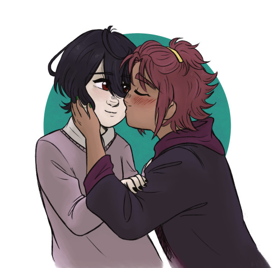
coloured my sketch from yesterday!! *clenches fist* It’s the childhood friends trope that gets me everytime
commission info!!
38 notes - Posted September 23, 2022
#4
random things about IDOLiSH7 i absolutely adore and it makes i7 one of the best shows i’ve watched (not kidding)
the ensemble cast is likeable, very well-written, noone feels left behind by the narrative or unexplored. you really grow to love all the characters, understand them. The character development blows you away; they all feel three-dimensional, all have their own stories to tell. They feel like real people
great music, and of great variety, too! at first you think you’re in for generic idol tunes, but even the main group, whose sound is the most ‘typical cheery idol’ type, branches out into different directions later
amazing storytelling and direction - the anime makes great use of various angles, as well as music to help convey feelings on screen; it definitely improves overtime, too.
drama, so much of it but it all feels very much justified, there isn’t drama just for the sake of drama. It alignes perfectly with the show’s themes, explores the highs and lows of the idol industry, as well as relationships between the characters.
the stories connect in unexpected ways... and then you realize the foreshadowing was already there! it’s very clever and satisfying
there’s so much love in it! the love in universe that characters have for each other, the love their fans give them; the love that emanates from the studio, the staff, the director... it’s all about love
there’s way more but I would combust if I started to explain it all. the point is - so many people in the western fandom spaces seem to dismiss i7 as yet another idol show (funnily enough it’s so huge in Japan), which has its perks (we’re all just here in our small corner), but it really is not doing justice to this great show. it’s so good... ahhh i love IDOLiSH7 I love it so much
52 notes - Posted October 19, 2022
#3
commission info!!
COMMISSIONS ARE OPEN!
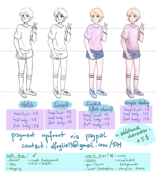
heyy, the inflation in Poland has been making it really hard to make ends meet and I’m jobless right now so I’m opening commissions! If you’re interested please contact me via PM or e-mail; all the info is shown above on my lovely boy Aira Shiratori but I’ll write the prices once again under the read more to make things easier - there are also art examples there!
SKETCH:
head/bust: 5$
half body: 6$
full body: 7$
LINEART:
head/bust: 7$
half body: 8$
full body: 9$
FLAT COLOUR:
head/bust: 9$
half body: 10$
full body: 11$
FULL COLOUR+SIMPLE SHADING:
head/bust: 11$
half body: 12$
full body: 13$
ART EXAMPLES:
See the full post
98 notes - Posted July 22, 2022
#2

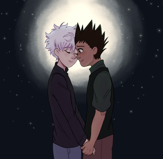
I'll give you everything I have
I'll teach you everything I know
I promise I'll do better
I will always hold you close
But I will learn to let you go
I promise I'll do better
Light by Sleeping at Last
boy it’s been a while.
commission info!
184 notes - Posted October 26, 2022
My #1 post of 2022

💕happy satogou day!! 3/15💕
318 notes - Posted March 15, 2022
Get your Tumblr 2022 Year in Review →
#tumblr2022#year in review#my 2022 tumblr year in review#your tumblr year in review#i cant believe this was an enstars and pokemon uear#my most popular post should be the reason gou stays in anipoke#anyway a shame the longest post is some vent thing#mmm this year was also hxh resurgence so good#also hey hey pls commission me#most of the reblogs on my commission post are me
2 notes
·
View notes
Note
I was reading your review on Shoyru and realized something I'm sure someone's already pointed out. In your list of dragon-like Neopets, Scorchio wasn't on there! Hopefully you'll tackle that one in a future review?


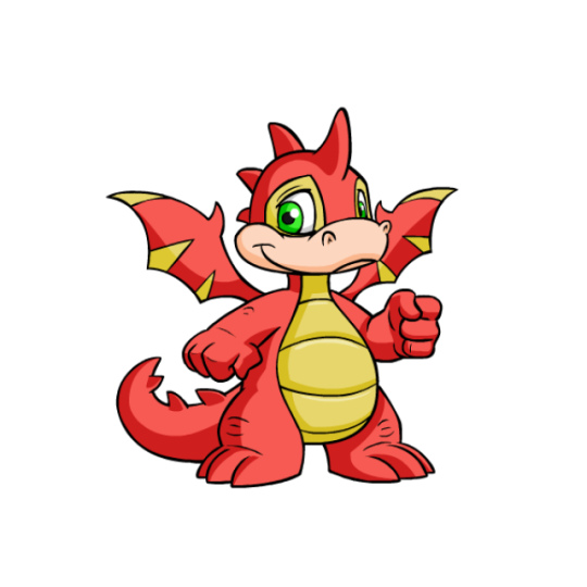

Scorchios are kind of your quintessential dragon Neopet. Compared to Shoyrus, Skeiths or Draiks, Scorchios don't have a super strong visual direction beyond just "bipedal dragon", which is a trait that also applies to the other three. I feel like if we're going to have four dragon pets they could've managed to vary them more, considering how many different types of dragons there are out there, but oh well.
From a visual standpoint, Scorchios have a pretty well-balanced design, detailed but not busy. They have a lined underbelly, some stripes on their wings that match the spikes on their backs and wings, and markings around their eyes.
My only visual complaint, outside of them being a bit generic, is that the peachy muzzle feels weird because it's too close to the yellow accent color to justify being a different color, and the yellow color itself is kind of a gross low-contrast mustard color instead of a nice cream or tan (the yellow Scorchio also has this color on its entire body instead of the more pure hue most yellow pets sport). Thankfully most colours fix this issue.

Scorchios also benefited from customization, even if they were saddled with a fist. The old art was incredibly dated, with little to no shading (look at those wings) and wobbly lineart. Outside of just improving the art, the customization version also fixes some of the wonkier aspects of the design, such as the weird leg anatomy, extremely tiny and dense tail spikes, and tiny eyes.
Favorite Colours:
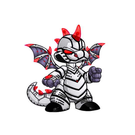

Robot: Robot gets a spot here for not only being a good-looking colour in general, but also because you get a two-for-one deal due to the casings being removable. The cased version a perpetually pissed expression and a striking black and white Tron look, with a few dark grey and red accents. The lightbulb spikes are particularly delightful. The uncased version shows off the dark grey in full and also places more emphasis on the red accents (along with being less pissed).

Woodland: The woodland Scorchio is based off the rainbow eucalyptus, a plant that 100% looks fake but is very much real.
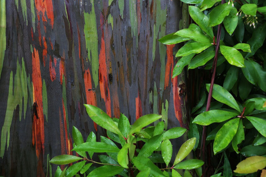
Not only does the dark base with green and red accents look particularly beautiful, but it also is a fun nod to the actual trees conceptually and makes for a memorable pet compared to the more generic wood-based ones. My only nitpick is that the leaf-wings don't really read as wings at all, and the random twig above the eye feels out of place and doesn't help with the wing issue. Still, it's very nice overall.
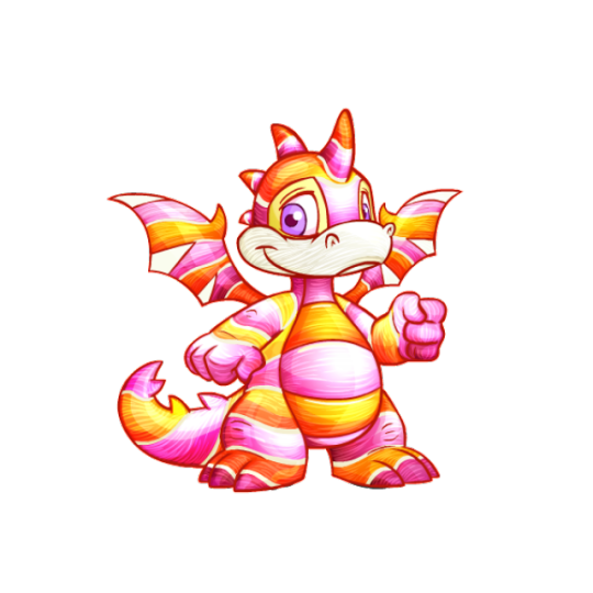
Candy: This one's relatively straightforward, but the pink and yellow palette is lovely, and the stripes really work well with the Scorchio's underbelly lines and pre-existing wing stripes. What I particularly like is that it actually has that very distinct lined texture that a lot of hard sweets have, which is detail they didn't have to add but I appreciate.
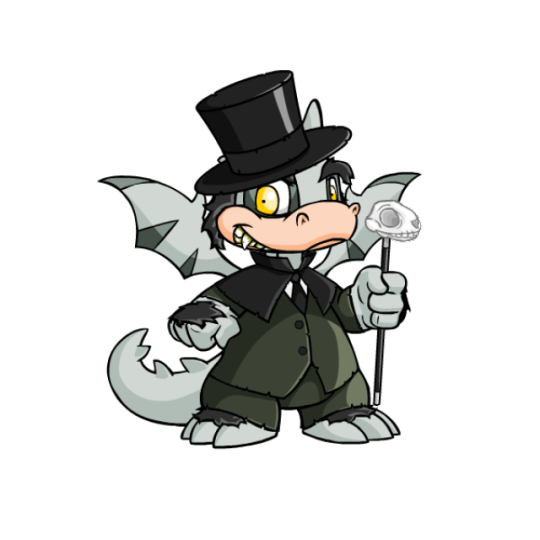
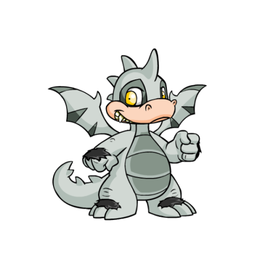
BONUS: Halloween got very close to being on the actual list, and I do really like its fun Jekyll and Hyde look, complete with skull cane (a nice way to use the fist) and formal attire. However, I had to knock it back a peg due to some weird details, like the hat absolutely not fitting the Scorchio's head correctly. The hands and feet also have fur, which not only feels random but really screws up the base color, which could've otherwise been a good option for customization in and of itself. The pink snout is also a little distracting, and probably would've worked better as a white to match the skull cane.
20 notes
·
View notes